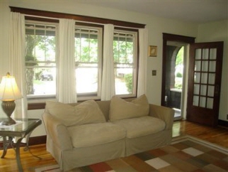
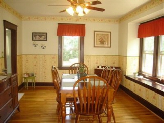
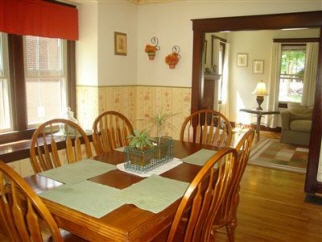
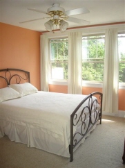
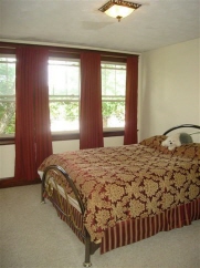
This is what my house looked like when I decided to buy it (pictures from when the old owner had it). Once my mom leaves today, I shall take some pics of what things look like after our handiwork of the week.


There may be a time and a place for everything. The difficulty is figuring out when and where.
8 comments:
I love all that light!
Yeah, even the before shots look pretty swell, Dr. C! Oh, and we know you've been busy with your mom this week, but we didn't want you to miss an important shout-out to you as a new homeowner that we put up the other day: http://roxies-world.blogspot.com/2010/06/deer-who-came-for-brunch.html.
Have fun settling in. You've got a beautiful new home!
Okay, since I haven't seen the after pics, I'll make comments, just to see how they match the after:
1. Front room & second bedroom are good -- the neutral color highlights the trim. A little color might be good, but only if you really want it.
2. First bedroom: Pepto-Bismol pink is not a color I'd personally want to wake up to every morning.
3. Dining area: That wallpaper!!! Aarrrgghhh!!! I predict that you will either a) get rid of it, or b) go over the top and accent the whole thing with two dozen collector plates.
Okay, that's what I think will happen in the "after" pictures. But let me say: yes, the light is gorgeous. All that space makes me drool with envy. And the heavy wood doors and mouldings are fracking gorgeous.
Congratulations!!
Oh: and may I assume that the cats have already claimed that lovely window seat in the dining room?
Pretty! That wallpaper looks surprisingly good for wallpaper; very subdued and neutral. At least it's not like my cousin's house which had psychedelic pink 80s wallpaper all over!
And I _love_ the dark trim! Don't paint it!
Nice!
Is it wrong that I love the before pictures?
Is/Was the bedroom really Pepto-pink? It looks more coral on my computer.
http://prettyinorange.com
Roxie, Thanks for the shout-out! I did see it but the week of home improvement with my mom didn't leave me time for commenting :)
Lawgirl - not wrong at all - the house is a great house, and even the before was not all that bad - just not my style at all. Too country or shabby chic or something. And that bedroom was more coral or orange or peach - but HIDEOUSLY bright (like blindingly so), especially first thing in the morning because that room gets direct sunlight in the morning. Now, I like to be awakened by the morning light, but I do NOT like to open my eyes and to feel like I am being blinded and need to scream "My EYES!!! My EYES!!!!" (Also, that color was exactly the color of my room when I was 13 years old, and I feel like I do not need to have it again.)
Post a Comment